


We’re all used to designing within constraints: it’s part of the job. But how often do you get to step away from a defined component library, ask important questions at the beginning and re-design an entire mobile platform from scratch?
At Front, this is exactly what we’ve been doing for the past year. We took a step back from our desktop experience to create what was best for our mobile users, not only from a software perspective but from a wellness point of view. As a designer, it was exhilarating to have this opportunity. I didn’t have to snap into previously established components, but instead got to define every element from the ground up, creating a new philosophy that will guide Front’s design language in the future.
In this article, we’ll be covering the different parts of the process from putting user wellness at the center of our redesign objectives, to partnering with research, data, brand, and engineering.
Our process: Reimagining our mobile app from scratch
To kick off the project, we wanted to develop a set of values and principles that would guide our design process through the redesign. Mobile is radically different from desktop and the way people use these two surfaces should reflect this. To uncover these insights and define our principles we took a look at usage patterns, interviewed users about their daily habits and learned where their experiences had room for growth.
Defining our principles and values
The first step we took as part of this project was to audit existing experiences across: android, iOS and desktop. Our objective with this audit was to use desktop as a north star for experiences while uncovering which mobile patterns were working best from iOS and Android and how we could create a truly cross device experience in react native leveraging the best of both worlds.
While we were doing the audit we also leveraged data and user interviews to highlight existing usage patterns on mobile to craft our new app around these. We found out the following:
1. Read first experience
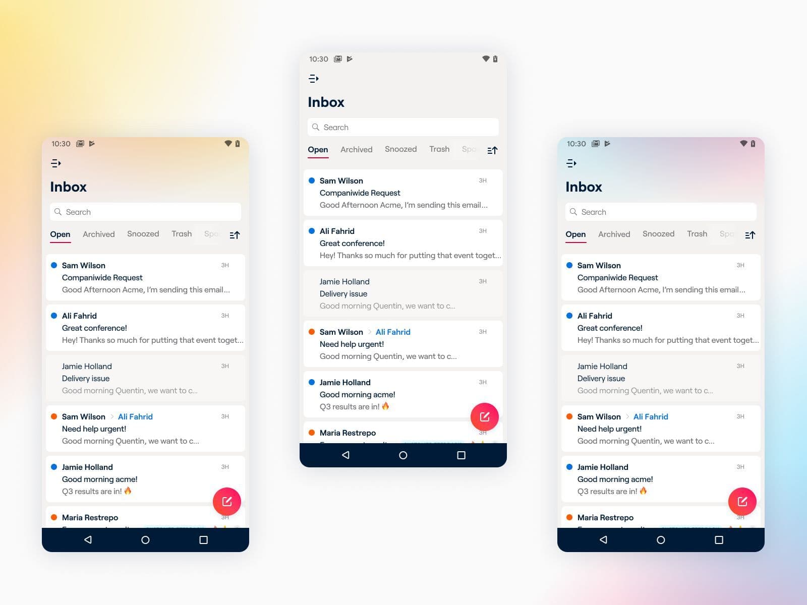
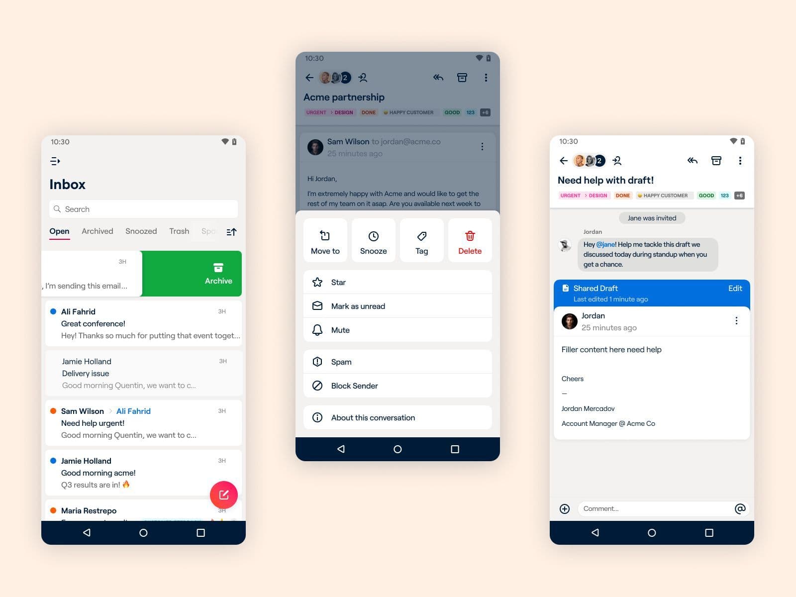
Most of the people using Front mobile apps use it as a read first experience. People are usually on the go in the morning before work, in-between lunch breaks, or on the commute home. From a design standpoint, this meant we wanted to prioritize reading and consuming space. Increasing viewports for messages and content, creating more comfortable to read email cells, and implementing collapsing headers.
2. Light triage
The next behavior we discovered was that a large portion of our users do use mobile as a light triaging platform to archive, assign, delete, etc. This helped us optimize experiences like bottom sheets to be the main input surface for triaging while implementing quick actions in our bottom sheets instead of just traditional list views in these.
3. Light compose
The final type of behavior we saw on mobile was composing, not that this was least important than the first two but it was the one that was interacted with the least on mobile. One of the challenges we had in the mobile platform was clearly communicating to users the difference between the comment composer and email replies. So a big focus of our re-design was optimizing for clarity in these two surfaces.
Defining our principles
With these insights established we defined our philosophy for designing in react native. Internally, this project was a huge undertaking. We migrated our codebases to react native, a technology that would allow us to inherit more features from desktop with less effort, keeping the mobile experiences up to date without duplicate work. With input from engineering, PM and design we came up with the following principles:
1. Companion app first
Desktop reigns supreme. As an email platform most of our users’ work happens on desktop, and we wanted to celebrate that. We didn’t want to lead the way in terms of features but wanted to make sure our experiences felt natural and consistent on mobile devices while optimizing our designs for tasks that are better on the go.
2. Design language experimentation ground
This was the most exciting part of my role. With mobile being a less frequented surface we considered it a lower risk area to try bold experiments and push our new design language. Part of these experiments also included testing how our dark mode palette would translate if we build that in the future, new typography implementation, new cell styling, and the use of gradients to promote user wellness.
3. True cross-platform experience
With the ability to design in react native we took a lot of shared patterns across iOS and Android but decided to keep navigation iconography and other orienting functions native to the respective platforms for people to feel at home in their devices.
Simultaneously designing and building the new app
The most challenging part of this whole process was that engineering and design efforts started simultaneously. To mitigate anticipated friction, we audited and prioritized backend efforts that could begin while design focused on big picture architecture decisions.
Agreeing on a general architecture direction early on bought design some time to focus on refining flows that had not been optimized for mobile and allowed the team to partner with the brand team to create a unique identity and personality for the app.
From a design perspective, it was great to work with engineering closely as it help us set up our Figma files in a way that components, especially icons had specific naming conventions that would be pulled into the product seamlessly.
Learnings
I learned a lot from this process, and I’m excited that’s it out in the world for people to use. Here are some of my takeaways that could be helpful for others embarking on a similar project.
Animations and gestures are complex to implement in React Native. Design has to adapt quickly to limitations and find creative ways to deliver the same level of delight.
Building a design system while it’s being implemented is super hard. One of the biggest lessons throughout this process was to document decisions thoroughly. Keeping a log helped answer questions during implementation and allowed us to write specs in an easier manner.
Respecting native navigation is super important. Designing cross-platform can be very challenging, and it’s super important to have both native Android and iOS users in the team to uncover poor practices that don’t scale well on each platform.
Interested in joining our design team?
Our product, design, and engineering teams work on all sorts of projects like this. If you’re interested in joining us, check out our open jobs.
Written by Nico Ramirez
Originally Published: 3 September 2021