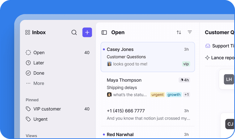




Learn what a customer service dashboard is, and how dashboards help customer-facing teams improve visibility, service quality, and operational performance.
Most customer service dashboards are just a wall of numbers that tell you what happened, not where the work is stuck or who’s holding it. For B2B teams, that gap is the problem.
As conversation volume grows and work moves across teams and channels, leaders lose the plot: who owns what, which commitments are slipping, and whether the operation is healthy. A dashboard that only reports metrics doesn’t close that gap; it documents it after the fact.
A customer service dashboard should centralize the operational signals that matter, show you where work is stalling in real time, and surface issues early enough to act before customers notice. Here’s what goes into building it, which metrics earn a spot, and how leaders use dashboards to make decisions.
Why customer service dashboards matter in B2B
A good dashboard pulls scattered operational signals into one place and shows you what’s happening as requests move across teams and channels. That visibility is where everything else starts.
Reveal operational blind spots before customers feel them
You can’t fix what you can’t see. Front’s Coordination Tax report found that only 5% of companies have complete visibility into handoffs, coordination time, and duplicate work. That lack of visibility is where friction hides, and delays quietly compound.
An analytics dashboard for customer service closes the gap by showing where handoffs are slowing down and which queues are growing faster than expected. With the signals in one place, you can step in before an internal snag becomes a customer problem.
Turn operational data into faster decisions
Watching day-to-day customer support signals lets you catch trends early and make resource calls based on evidence rather than instinct.
Picture a logistics company that spots a spike in escalations tied to one regional warehouse. Dig into the data and the cause is clear: The site is understaffed. The operations leader reassigns agents before the backlog spreads and before other teams have to absorb the fallout of missed SLAs and mishandled queries. A localized issue is caught early rather than turning into a mess that’s cleaned up late.
Create ownership and accountability across teams
A customer service dashboard makes ownership impossible to hide. It shows which team or agent holds each request and how long it’s been sitting there. When a billing inquiry stalls with finance, the dashboard names the owner and flags the stuck handoff, so a leader can step in before the delay reaches the customer.
Scale customer operations without losing control
The more customer service operations grow, the harder it is to track conversations that span multiple teams and channels. A dashboard keeps the important data — conversation volume, queue health, response times — in one view and shows where pressure is building. This clarity is what lets leaders balance workload and hold service quality steady as volume climbs.
Connect operational performance to customer outcomes
Put operational metrics and customer outcomes on the same dashboard, and the cause and effect stops being a guess. You can see how quick responses drive SLA compliance and how faster resolution moves CSAT.
What metrics should a customer service dashboard include?
The strongest dashboards pair customer-facing outcomes with the operational KPIs behind them. Front’s Support Report is an example of a customer service dashboard that provides performance insights based on response-time metrics and CSAT scores.
Here are the metrics that make a customer service dashboard useful.
First response time
First response time (FRT) tracks how quickly your team gets back to a customer the first time. A fast first reply signals that you take the request seriously — which builds trust and reduces the “Any update?” follow-ups that clog the queue.
When FRT starts climbing, you have two levers: Add capacity for first responses, or tighten triage and routing so delays stop compounding.
Resolution time
Resolution time captures how long it takes to fully close an issue. Most teams track a few related metrics alongside it — first-contact resolution (how much gets solved on the first try) and average handle time (how long reps spend actively working each request).
Read resolution time and response time together to gauge efficiency in real time and adjust operations the moment the numbers slip.
SLA compliance
SLA compliance shows how consistently your team meets contractual targets. In B2B, this isn’t a vanity metric — a breach can trigger penalties and strain the relationship.
Tracking it closely lets you get ahead of breaches rather than explain them. Stewart Travel Management leaned on improved reporting and tighter SLA monitoring to reduce its average response time to 39 minutes, well within its 90-minute target.
Customer satisfaction
Customer satisfaction (CSAT) tells you how customers felt about a recent interaction. Watch the average to see whether you’re meeting expectations, then read individual responses to find your top performers and your soft spots.
Escalation volume
Escalation volume tracks how many issues get bumped to specialists or managers. Some escalation is normal, but persistently high numbers mean frontline staff lack the training or resources to solve problems themselves. Sudden spikes point to operational breakdowns or account-specific problems.
Workload and team performance
Conversation volume and workload metrics are how you keep work balanced across teams and agents and spot inefficiencies worth fixing.
GLT Logistics is a sharp example: Using dashboard insights, it clarified ownership across more than 14,000 customer emails each month and cut processing time by 83%.
How customer service leaders use dashboards to make decisions
Dashboards are more than just reporting tools. Use them to improve coordination across your operations by following these best practices.
Align dashboard metrics with business goals
Build your dashboard around what your business actually competes on. If your product wins on being intuitive, track customer effort scores. If your growth runs on referrals and word of mouth, put Net Promoter Score front and center. Generic metric sets measure everyone’s business but yours.
Watch leading indicators, not just lagging ones
A dashboard should tell you what happened and what’s coming. A spike in tickets or escalations can flag churn risk; a cluster of issues nearing their SLA limit signals breaches about to land; and lengthening queues predict slower response times that follow as the backlog builds. Read those leading indicators, and you fix problems before they arrive.
Make dashboards actionable
A customer service dashboard must support better decision-making. Make it more actionable by tailoring analytics to a specific audience and only including relevant metrics. An executive dashboard highlights renewals and retention; a support leader’s dashboard shows SLA risk, queue health, and response times.
Set a target for every metric and flag it the moment it’s missed, so the viewer knows exactly when to act. Add trend lines so people see where performance is heading, not just where it stands today.
Use workload data to balance capacity and staffing
Workload data is your early-warning system for capacity. Queue growth and ticket backlogs are the operation telling you it needs more staff or better self-service before customers feel the strain.
Track workload at both the team and agent level, and redistribute the moment the load tilts. Automated routing helps here by sending each issue to whoever has the room to take it.
Catch coordination risks before they reach the customer
Most operational failures are coordination gaps. Front’s Coordination Tax report found that 64% of companies had at least one customer-facing coordination failure in the past three months — inconsistent answers, lost context, or customers being asked to repeat themselves. Your dashboard should surface these while they’re still fixable.
Say a financial services company sees resolution times drag every time an issue passes from operations to support. Spotting the pattern, the team rebuilds the workflow before onboarding a major new account — so a coordination gap never becomes that customer’s first impression.
Stop reporting on customer service, start running it with Front
A customer service dashboard is only worth having when it drives better decisions, not just a tidier status update. Front gives teams shared visibility into the metrics that shape the customer experience inside the conversations and workflows where the work happens, not buried in a report no one opens.
Front’s customizable dashboards turn performance data into action. Boostability used Front Analytics to increase efficiency and respond 2.5 times faster.
Try Front to see what happens when a dashboard stops describing your operation and starts running it with real visibility, clear ownership, and service performance.
Download Front’s Coordination Tax report to learn how coordination failures affect performance, and explore the Support Report for response times and CSAT benchmarks.
FAQ
How often should customer service dashboards be reviewed?
Track your main customer service KPI dashboard daily, and review all dashboards on a weekly and monthly basis to spot wider trends and strategic insights.
What are the different types of customer service dashboards?
The main types include high-level executive dashboards, support leadership dashboards, operations dashboards, and customer experience dashboards.
What are common dashboard mistakes that limit visibility?
The usual traps: tracking data without tying it to an outcome, ignoring ownership and workload signals, and keeping dashboards siloed instead of sharing them across teams.